
Intelia · 10th anniversary visual identity
Ten years,
one full turn.
Intelia, which presents itself as the first Conversation Intelligence platform in Brazil, turned 10 in 2025 and trusted Harmony with the identity of the celebration. This page follows the design of the project: a wheel of ten spokes, one per year, turning around the same axis.
01 · The axisOpen the list of the 10 spokes
Spoke 01 of 10 · The axis
The 1 is the spoke.
The 0 is the wheel.
Everything turns around a seal: the number 10 inside a blue rounded square. The blue is Intelia blue. In the corner of the zero sits a quarter circle in orange, the color of PhoneTrack, the company Intelia grew out of. The seal brings both phases of the story into one drawing.
It sits beside the name, horizontally, or below it, stacked. The white and black versions exist for when color is not an option.
- Pieces
- 8 logo versions
- Formats
- horizontal and stacked · color, white and black




Spoke 02 of 10 · Color and type
Black, blue
and an orange accent.
Black and blue form the base. White and gray give room to breathe. Orange appears sparingly and always on what needs attention: the dates on the timeline, the value icons, a detail of the seal.
The typeface is League Spartan, geometric and heavy. It holds the number 10 large on a panel and small on a profile icon.
- Colors
- measured on the final pieces
- Typeface
- League Spartan, open license (OFL)
- Intelia blue#0070FF
- PhoneTrack orange#F77E14
- Black#01070E
- Graphite#272526
- White#F0F0F1
- Gray#DADFE6
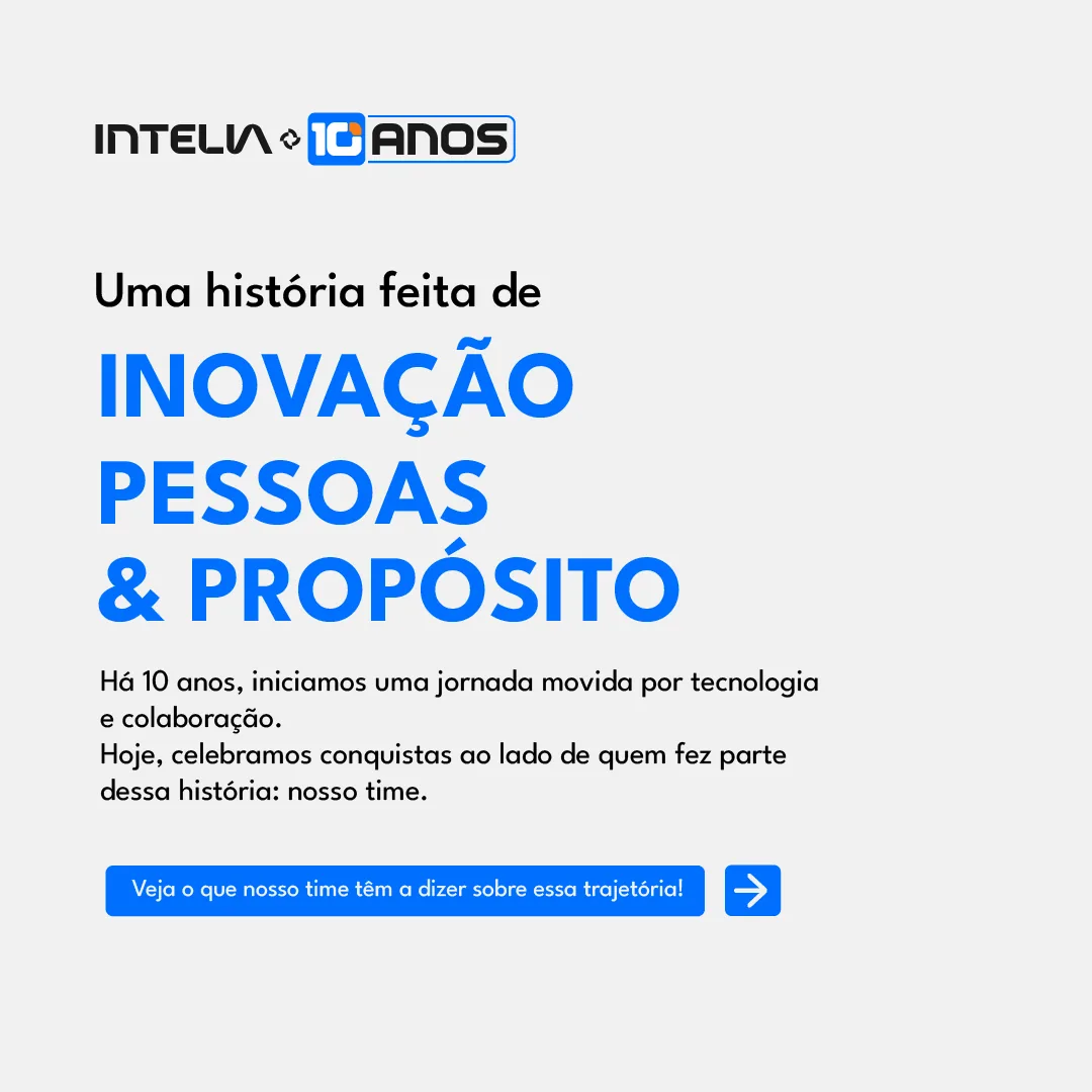
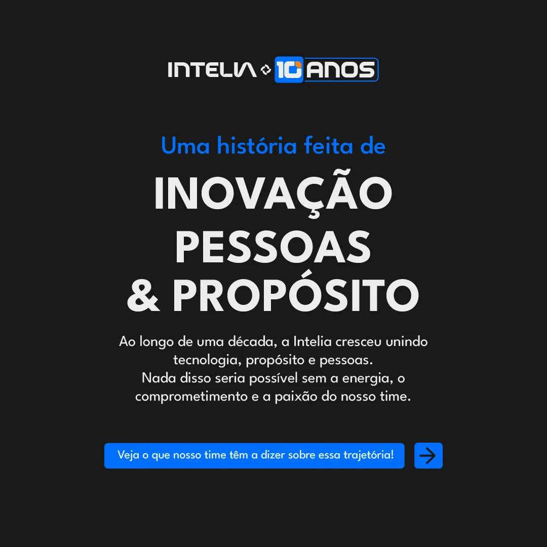
A story made of innovation, people and purpose.
RegularSemiBoldExtraBold 10 ANOS
Spoke 03 of 10 · Profile icons
Small,
without losing the 10.
Six icons to swap the profile picture of the company and the team during the anniversary: three backgrounds (blue, black and white) and two layouts, stacked and horizontal.
The real test is size. In a social media comment the icon shows at about 40 pixels, and the 10 has to stay readable there.
- Pieces
- 6 icons
- Size
- 1200 × 1200 px

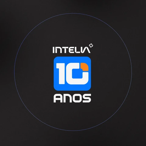
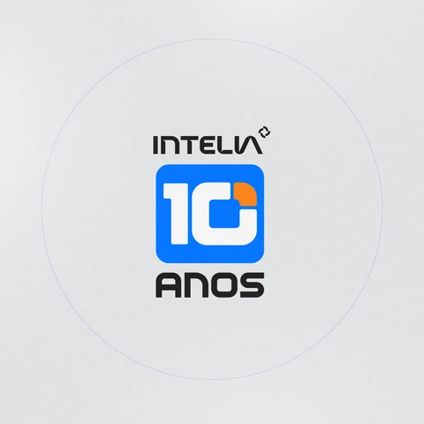
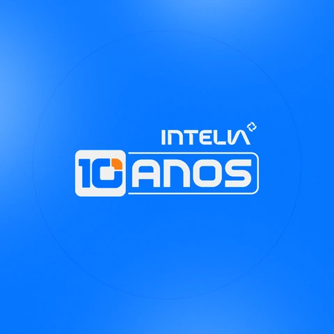
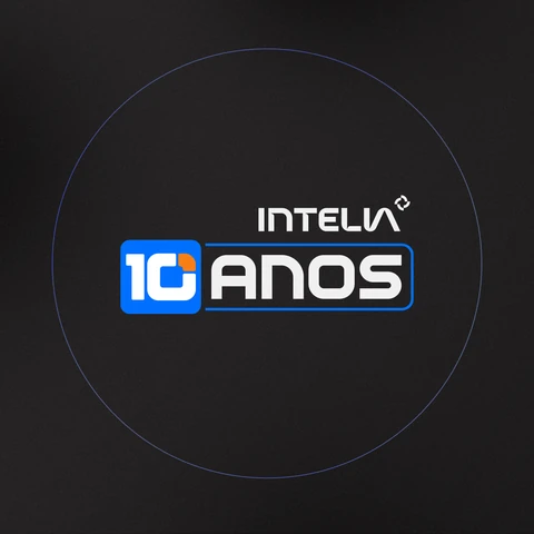
The same icon in five sizes. At 40 px the 10 still reads. At 24 px what remains is the shape of the seal, which is enough to recognize the brand.
Spoke 04 of 10 · The timeline
Ten years
on a single wall.
The first two carousels tell the story of the company year by year. Placed side by side, they become one continuous line from 2015 to today, with an orange date at each stage.
The first half is dark: three partners, the first office, the events, the recognition. The second is blue: the pandemic, the rebranding, the birth of Intelia in 2024 and the products of today. The color change tells the passage from PhoneTrack to Intelia.
- Pieces
- 2 carousels of 7 slides
- Format
- 1080 × 1080 px per slide
- Here
- both in sequence, from 2015 to today


Spoke 05 of 10 · People
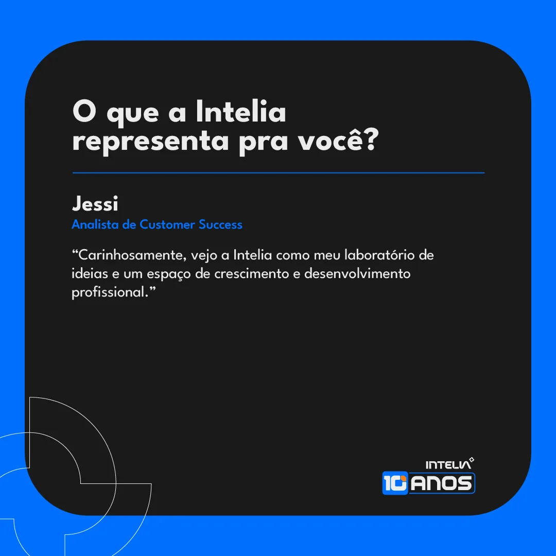
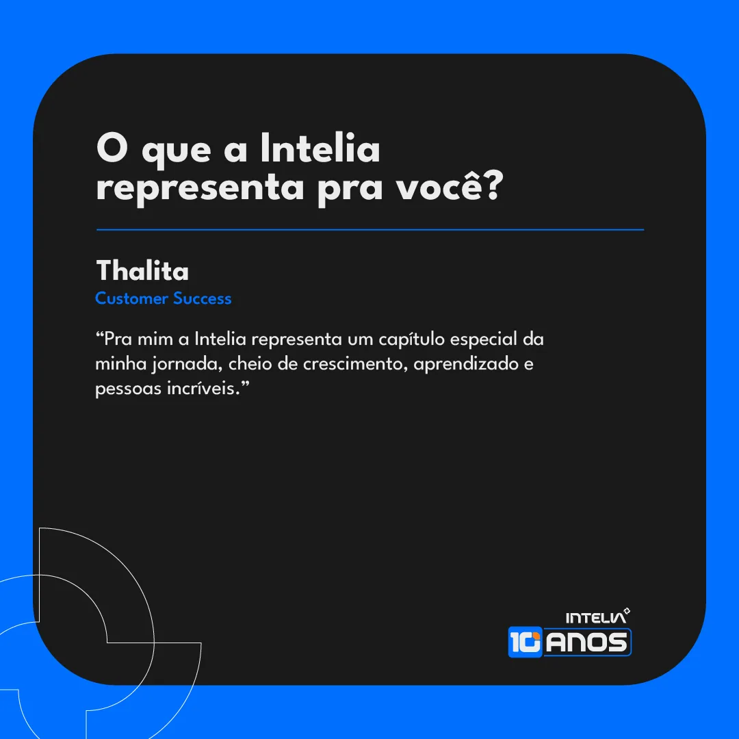
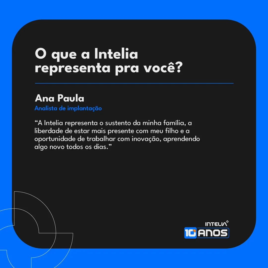
What does Intelia
mean to you?
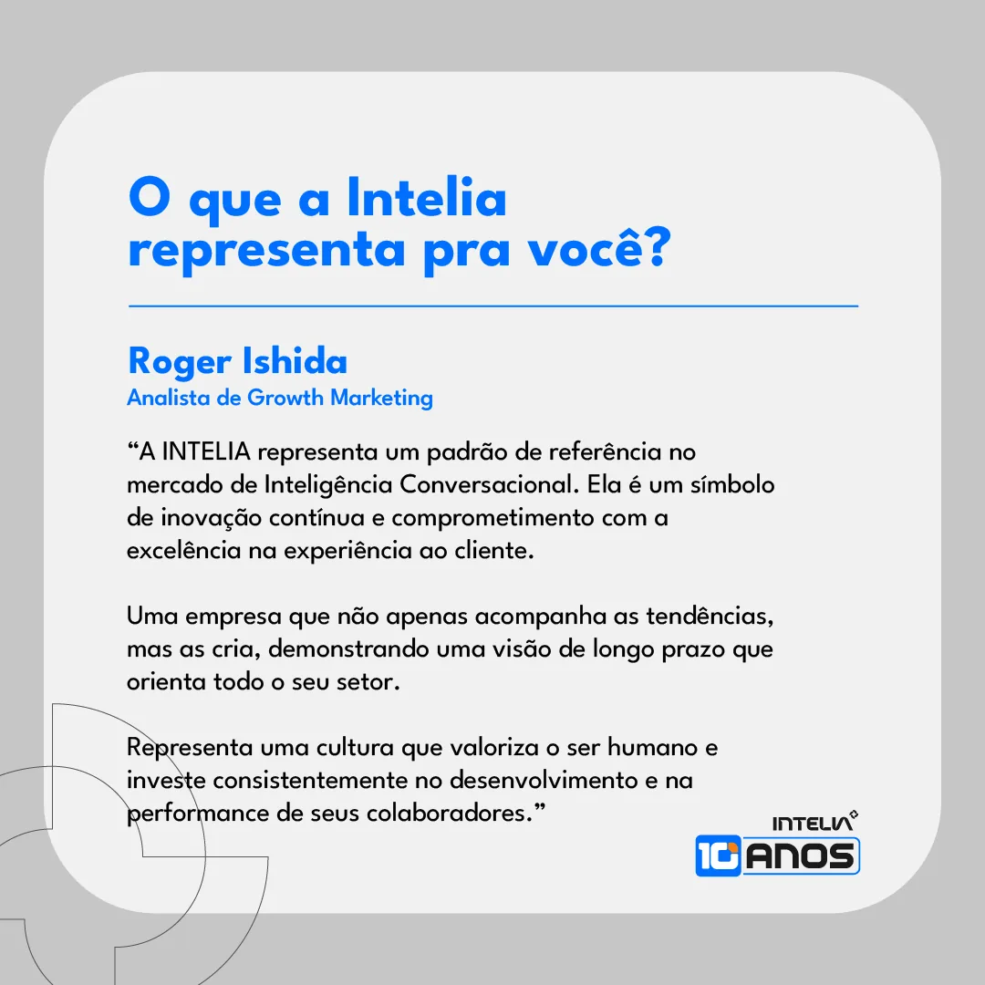
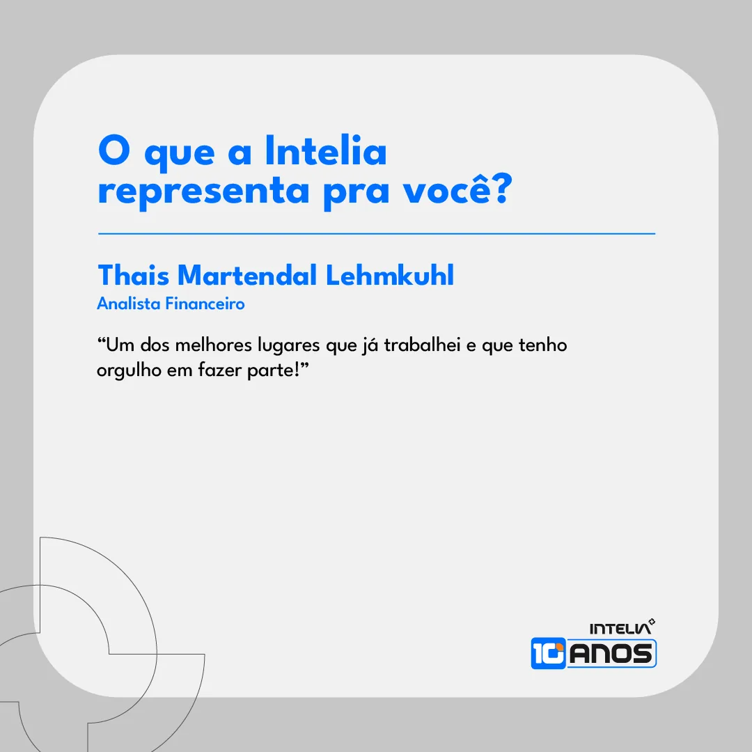
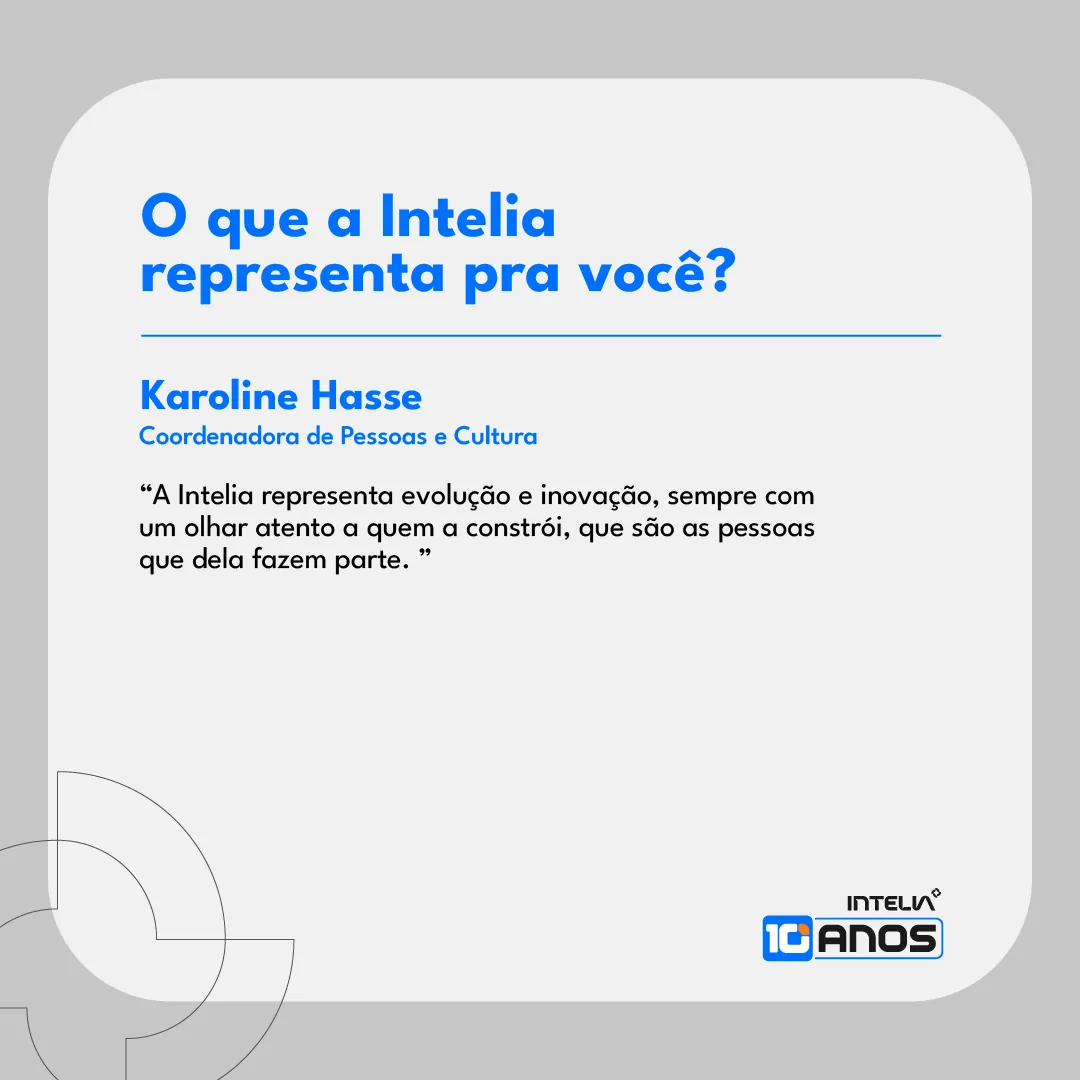
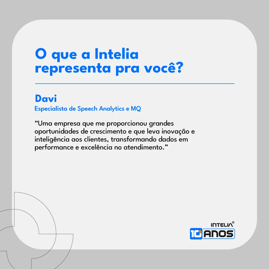
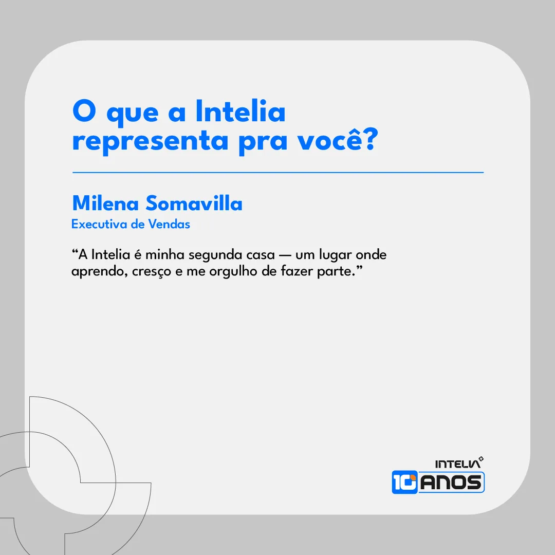
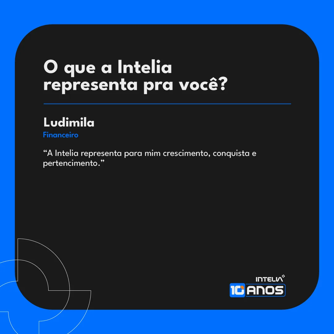
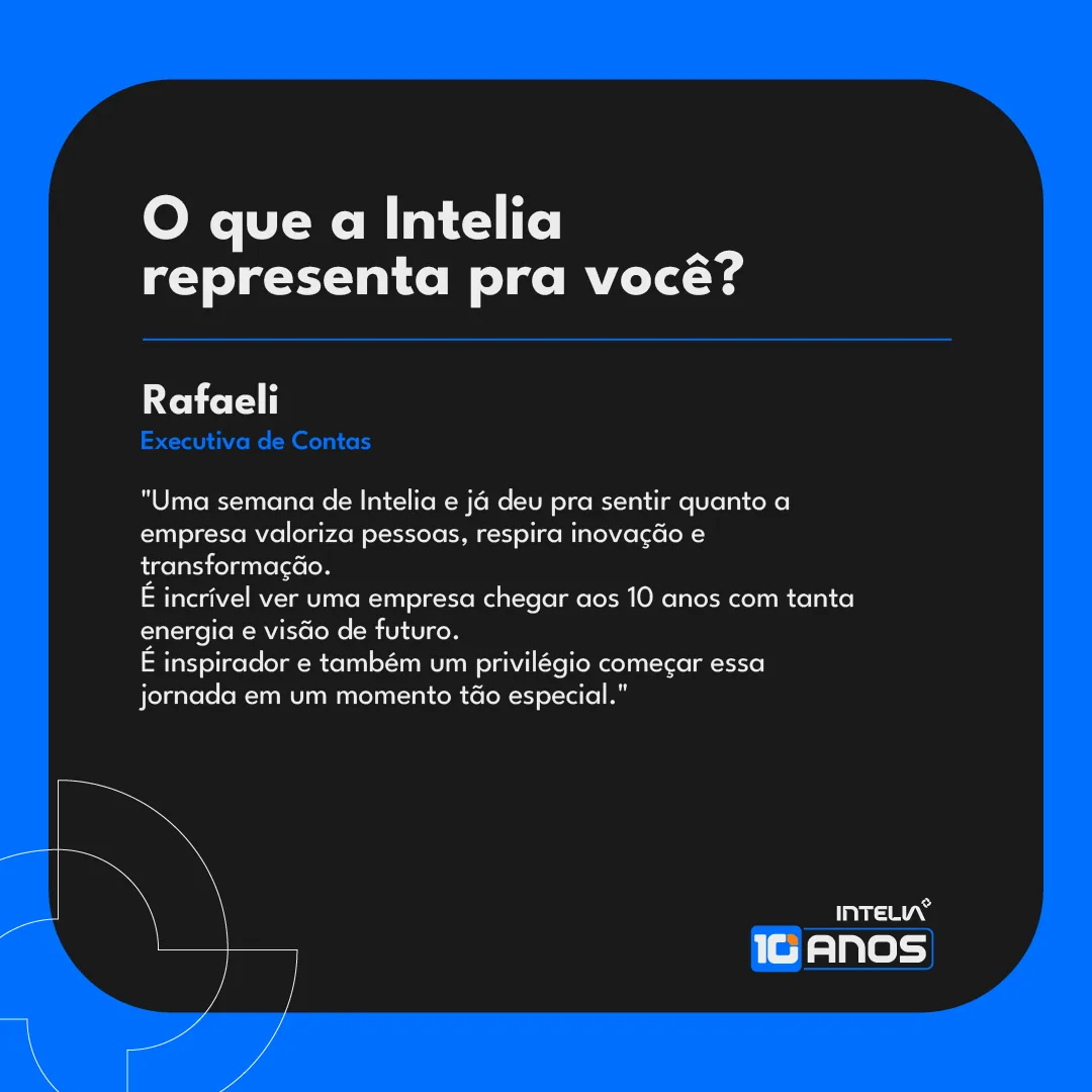
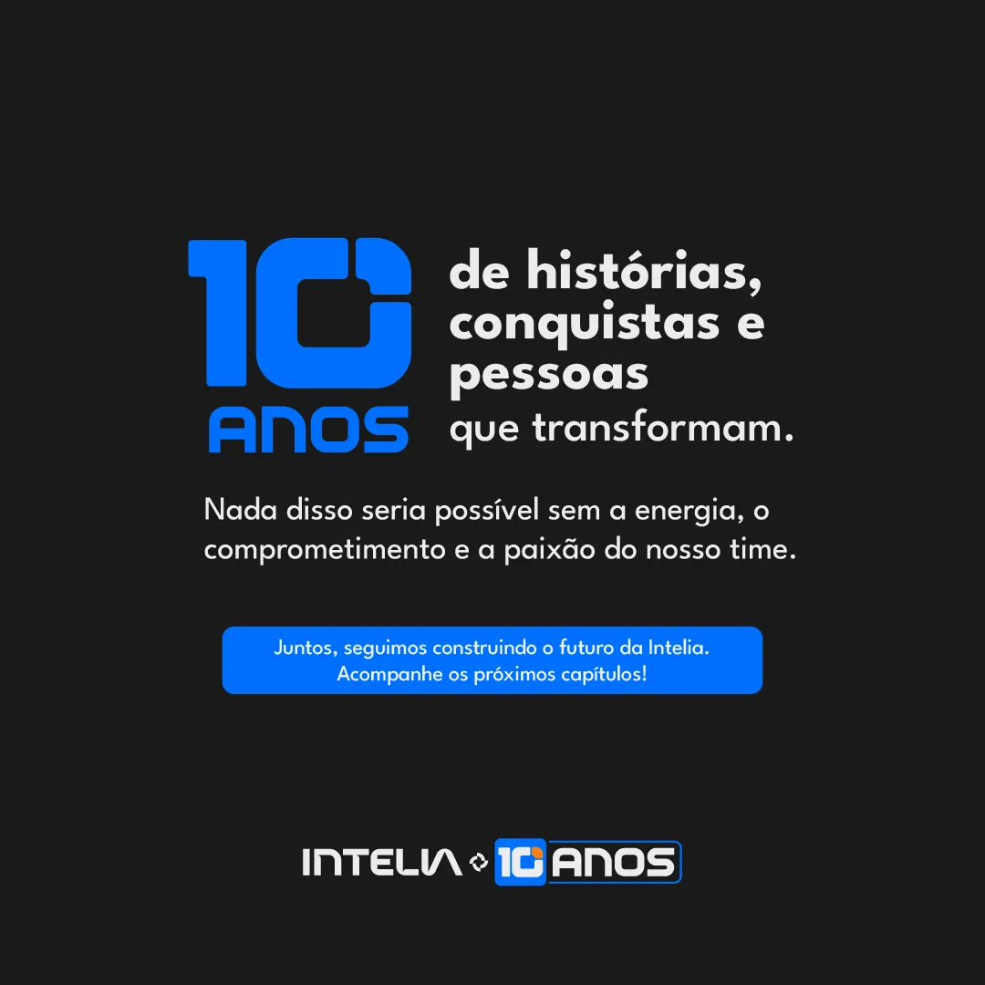
The same question was asked to the people who work there. The answers became two carousels, one light and one dark, with the name, role and words of each person.
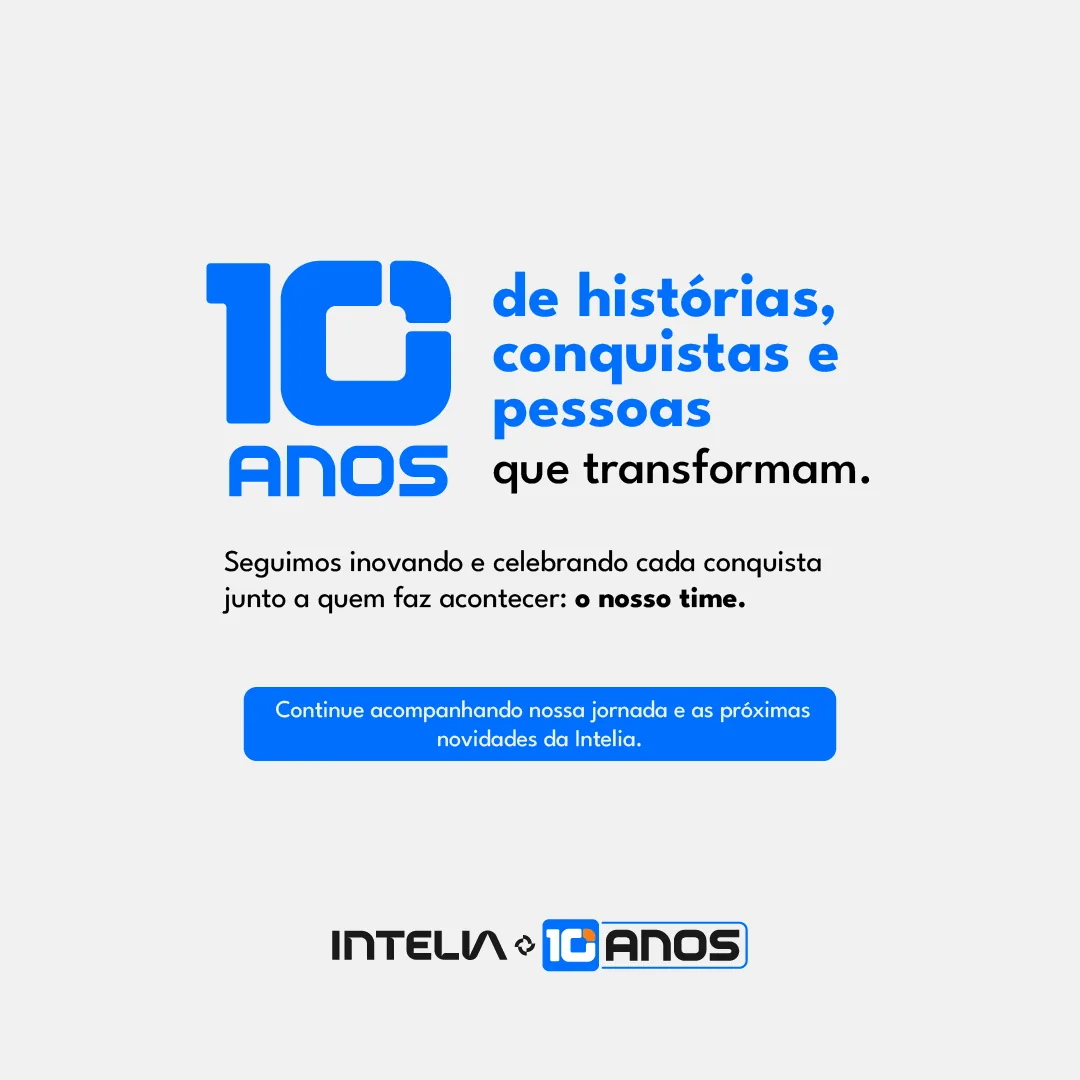
The card is sober so the text stands out. The opening and closing of each carousel repeat the campaign line and lead back to the brand.
- Pieces
- 2 carousels of 7 slides
- Voices
- 10 people from the team
Spoke 06 of 10 · Voices
Fourteen testimonials,
one opening.
Clients, partners and team members recorded testimonials about the 10 years. Each video opens with the animated brand signature and runs vertically, ready for stories and reels.
There were 14 videos. Here are four, two from clients and two from the team.
- Pieces
- 14 vertical videos
- Format
- 1080 × 1920 px
Spoke 07 of 10 · On the wall
From the feed
to the wall.
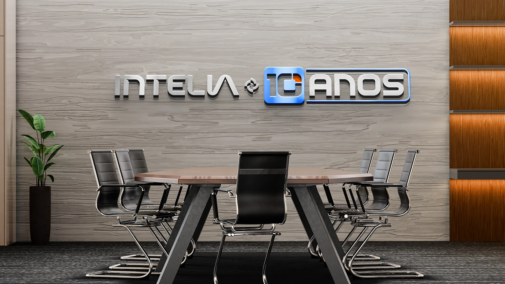
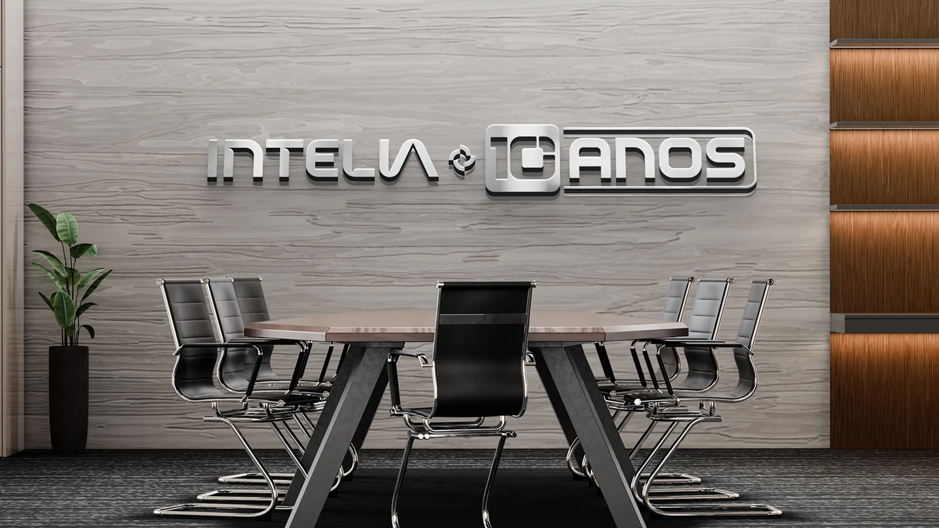
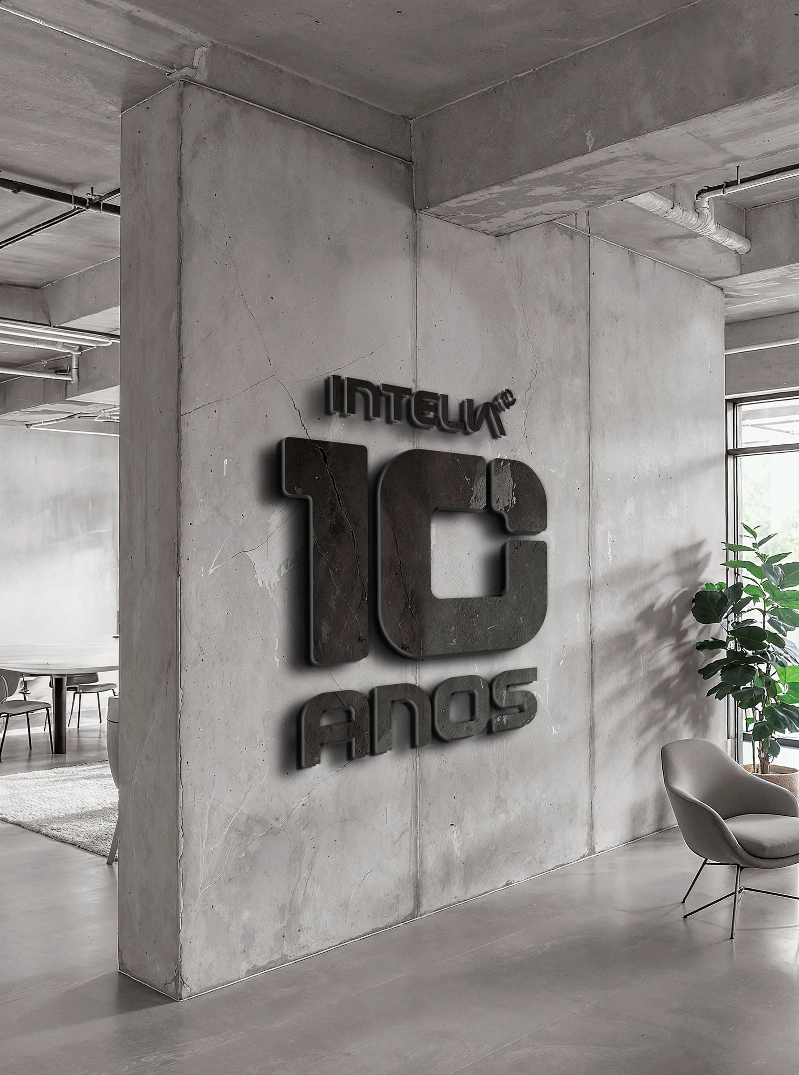
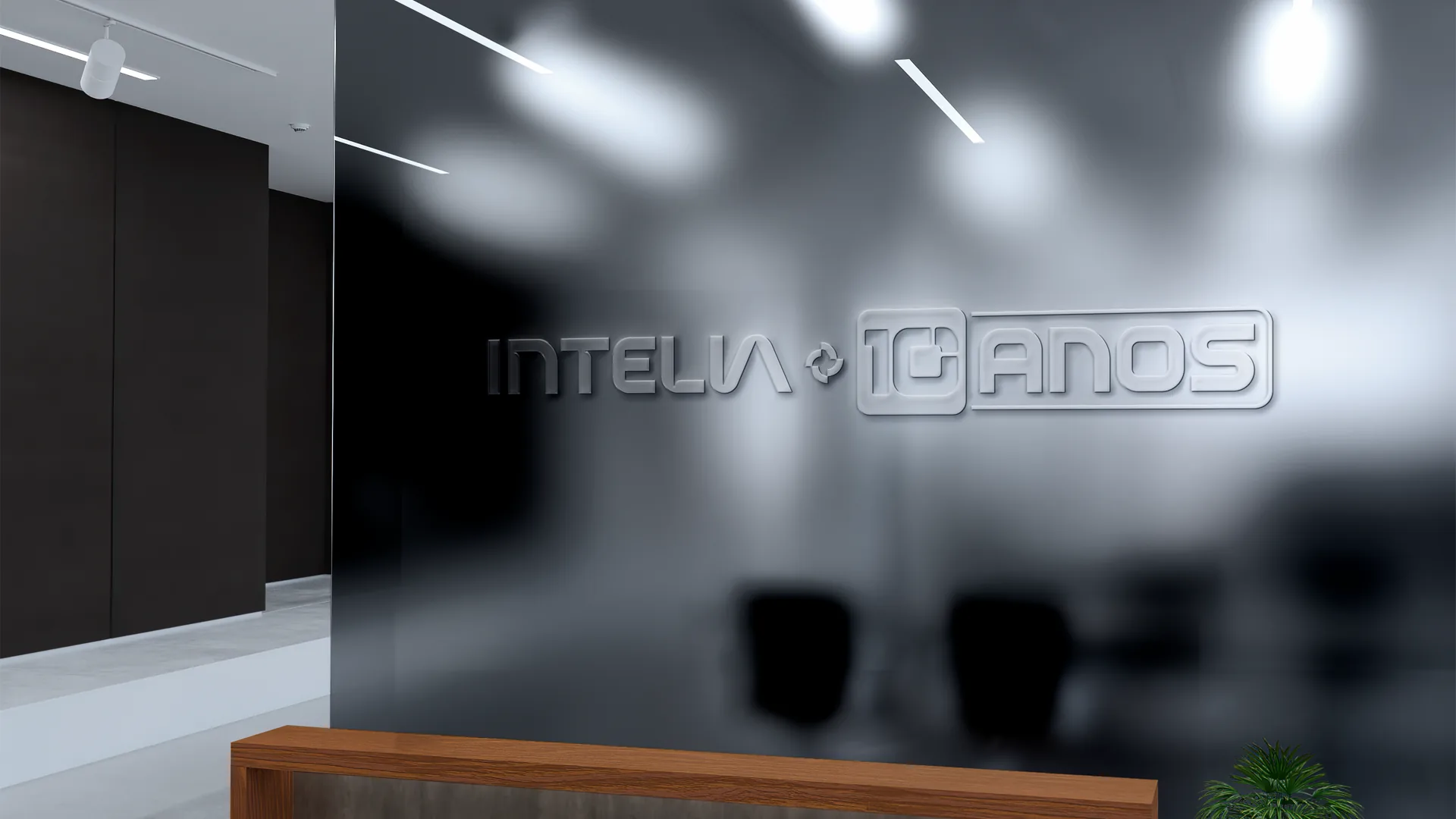
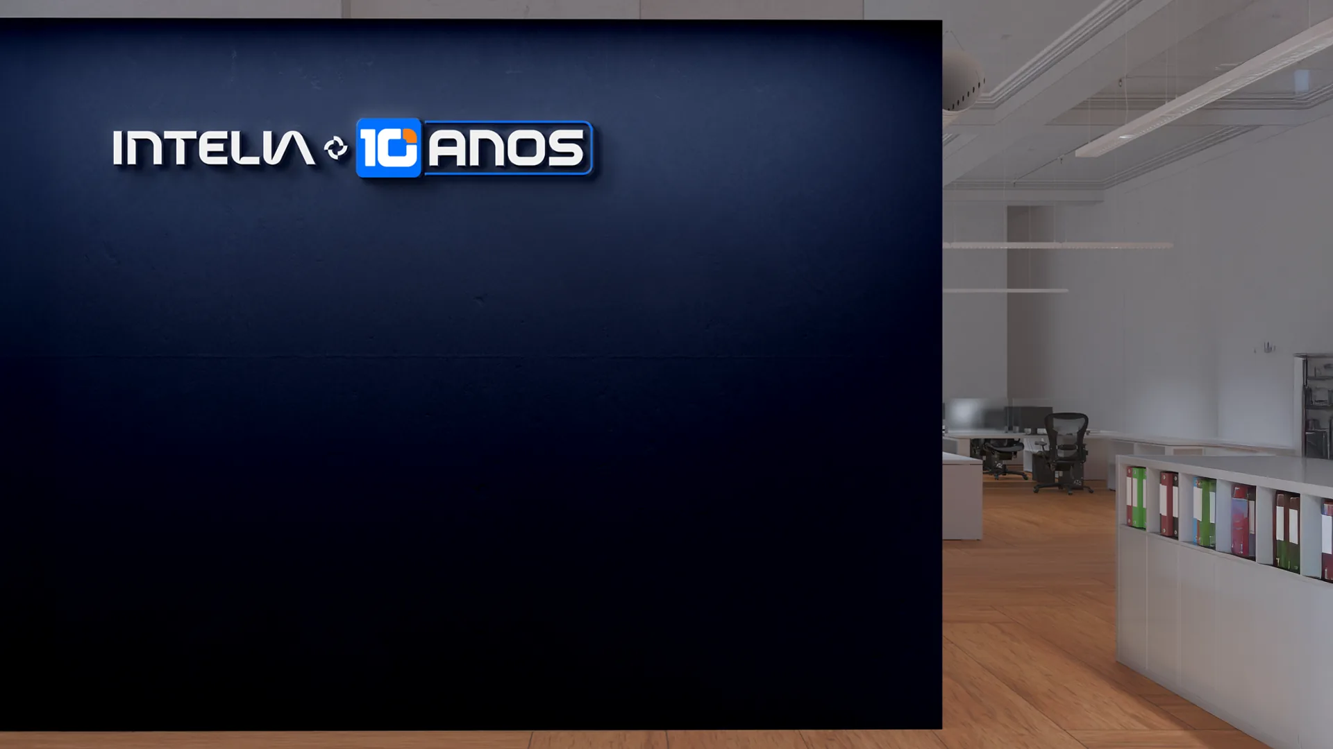
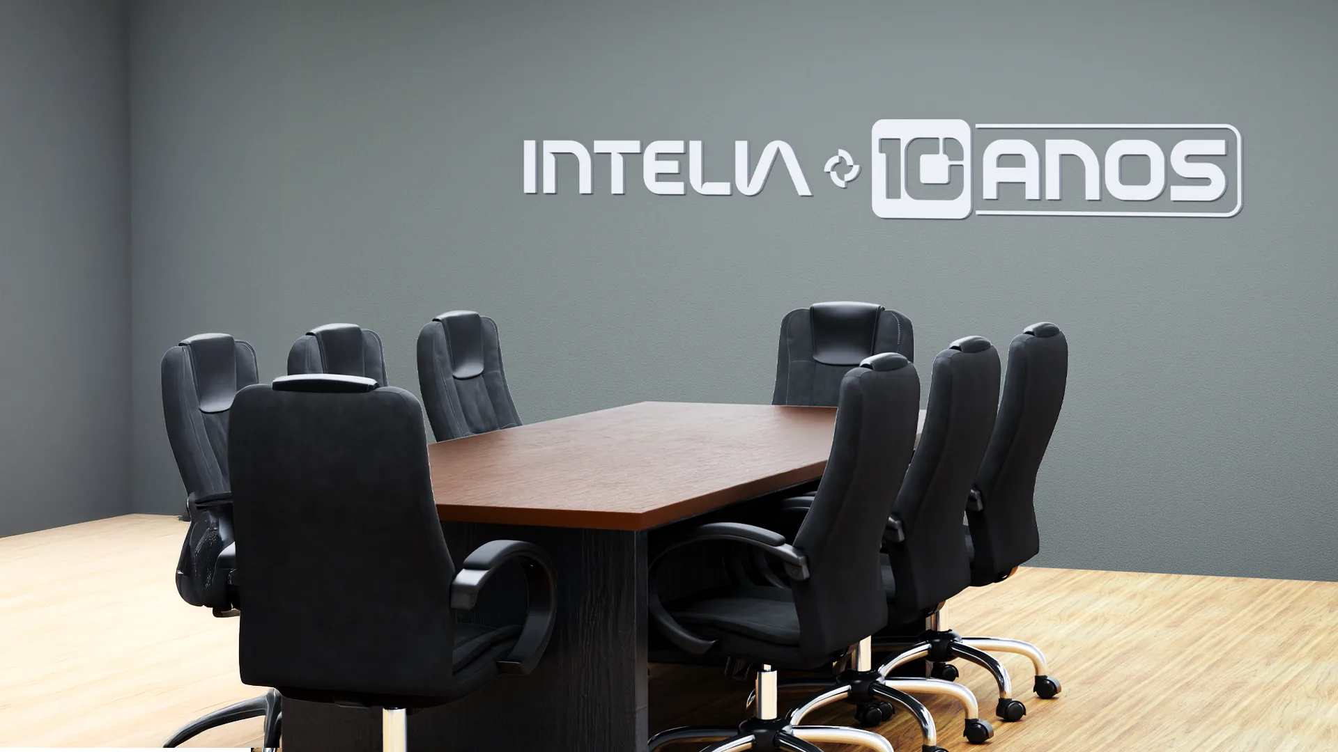
The celebration left the screen. The mockups show the seal as dimensional lettering in the meeting room, on concrete, on glass and on a blue wall.
The same wall was designed two ways: all metal, or with the 10 in blue. Side by side, you can see how much the blue square weighs in the reading.
- Pieces
- 6 space mockups
Spoke 08 of 10 · On screen
The party on
the desktop.
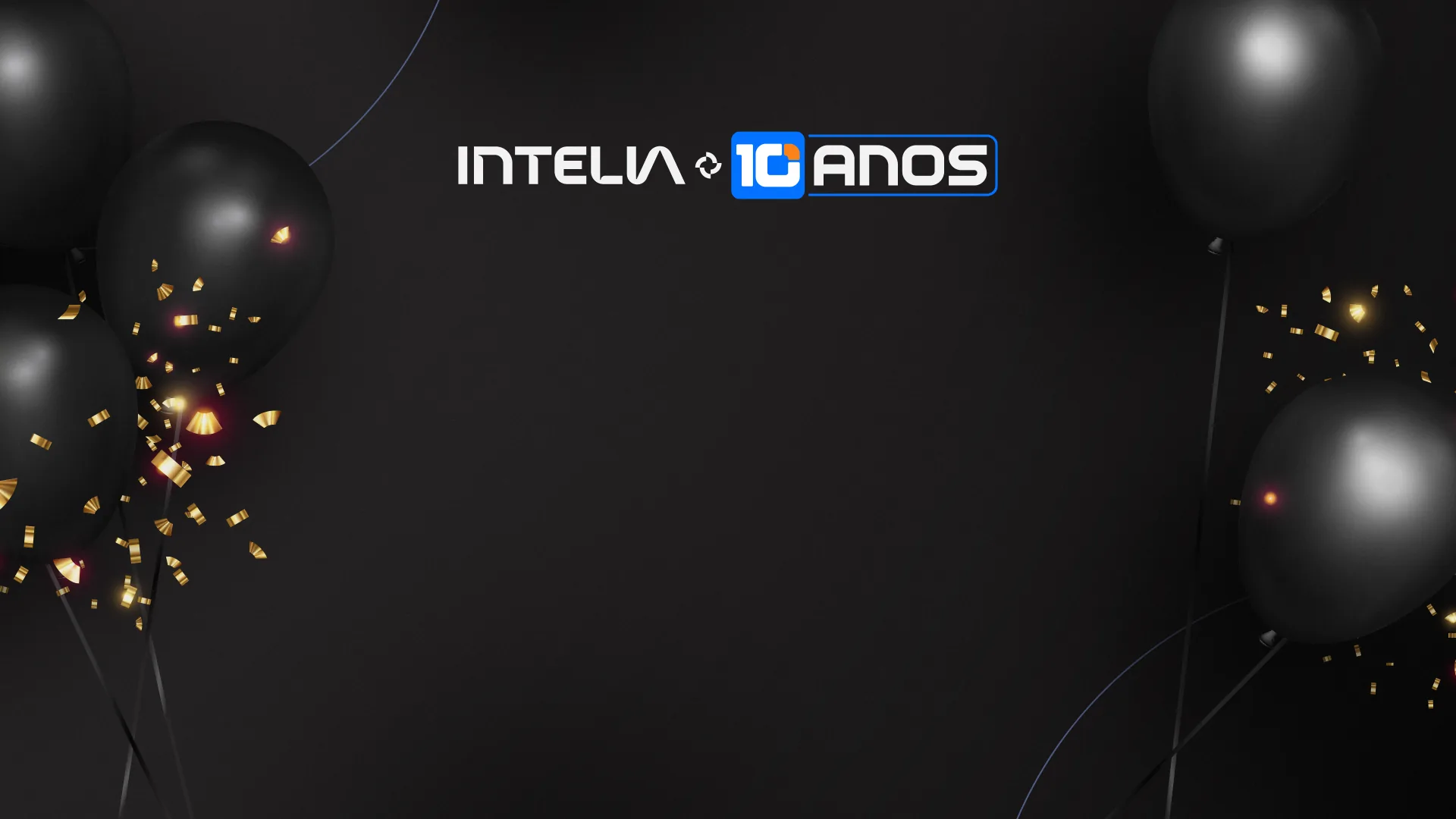
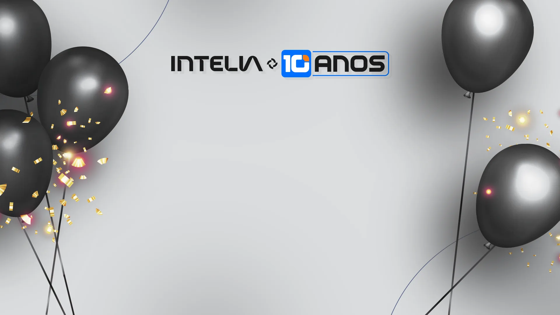
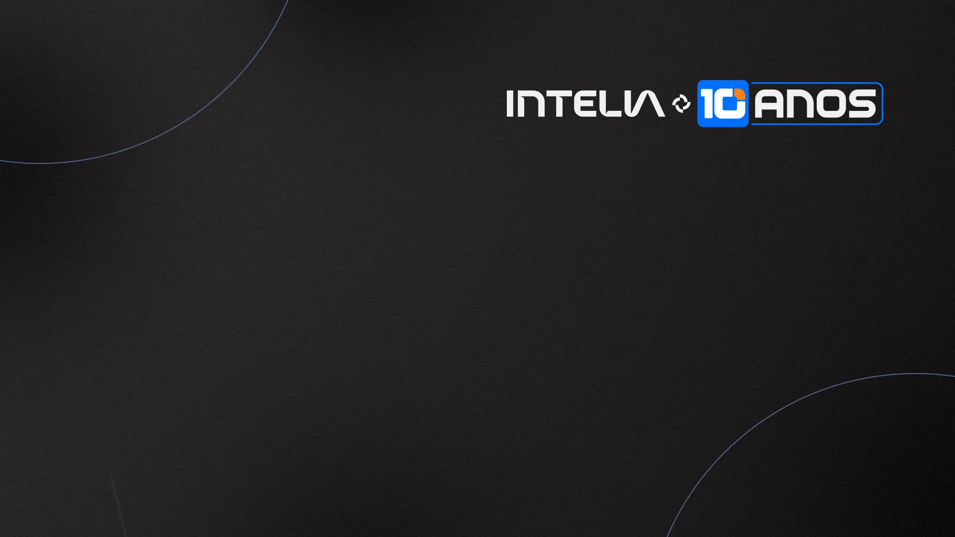
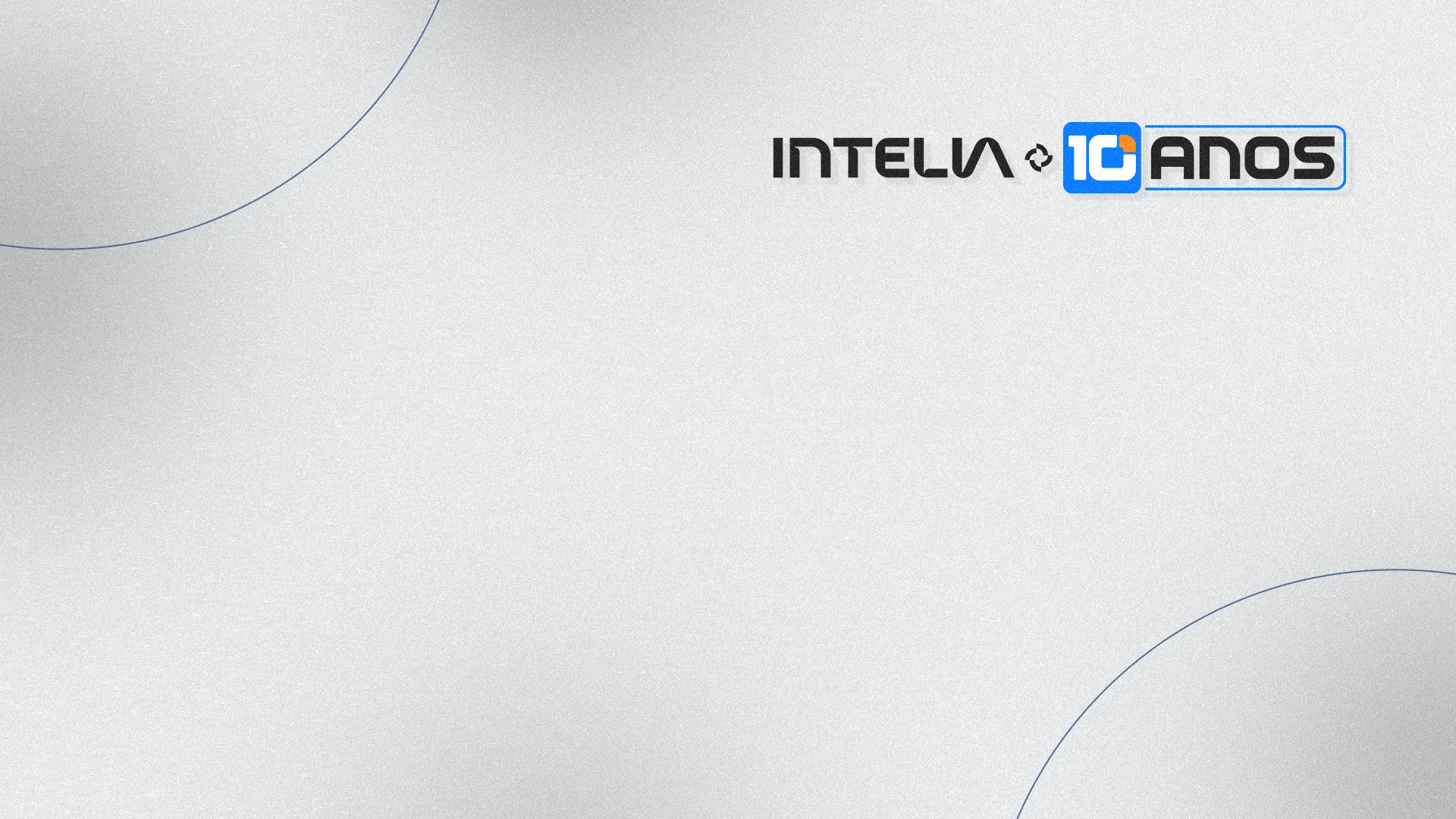
Four wallpapers for the team computers: two with balloons and sparkle, light and dark, and two cleaner ones, with just the brand and curved lines.
The brand always sits at the top, right or center, away from the icons that usually fill the left of the screen.
- Pieces
- 4 wallpapers
- Format
- 1920 × 1080 px
Spoke 09 of 10 · E-mail and LinkedIn
In every conversation,
on every profile.
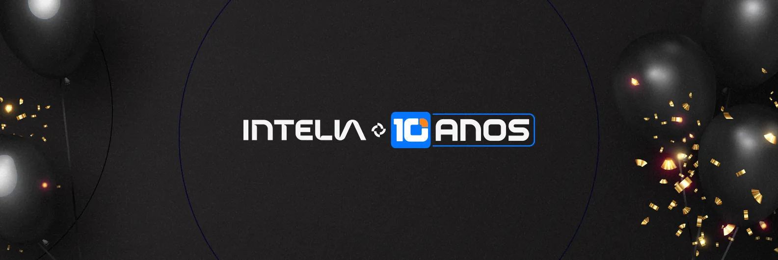
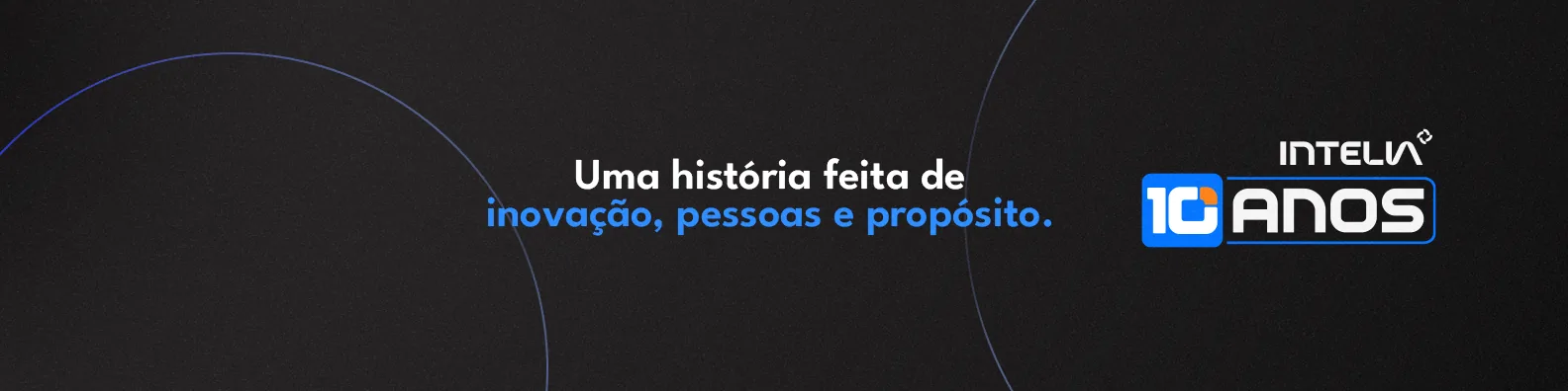
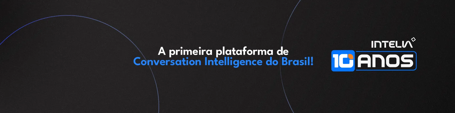
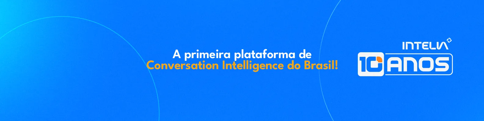
E-mail headers and LinkedIn covers carried the anniversary into every message and every team profile. The covers alternate blue and black and carry the two campaign lines.
Below, each cover appears with one of the icons from spoke 3, the way it looks on a real profile: the brand does not fight the photo, and the two complete each other.
- Pieces
- 2 e-mail headers · 6 LinkedIn covers
- Formats
- 1585 × 530 and 1584 × 396 px




Spoke 10 of 10 · In hand
What makes
us Intelia?
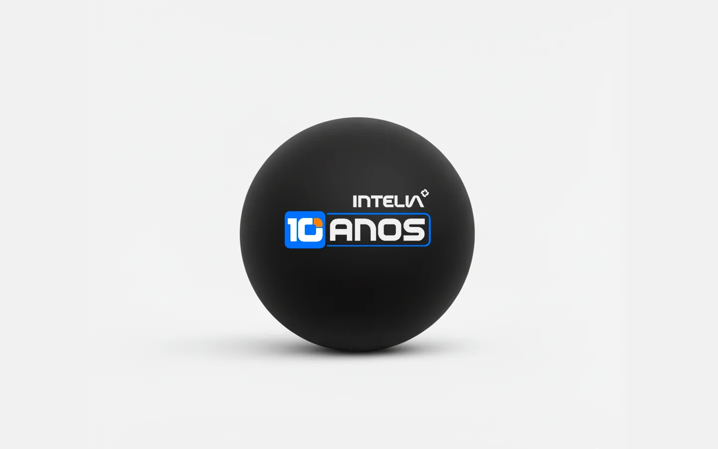
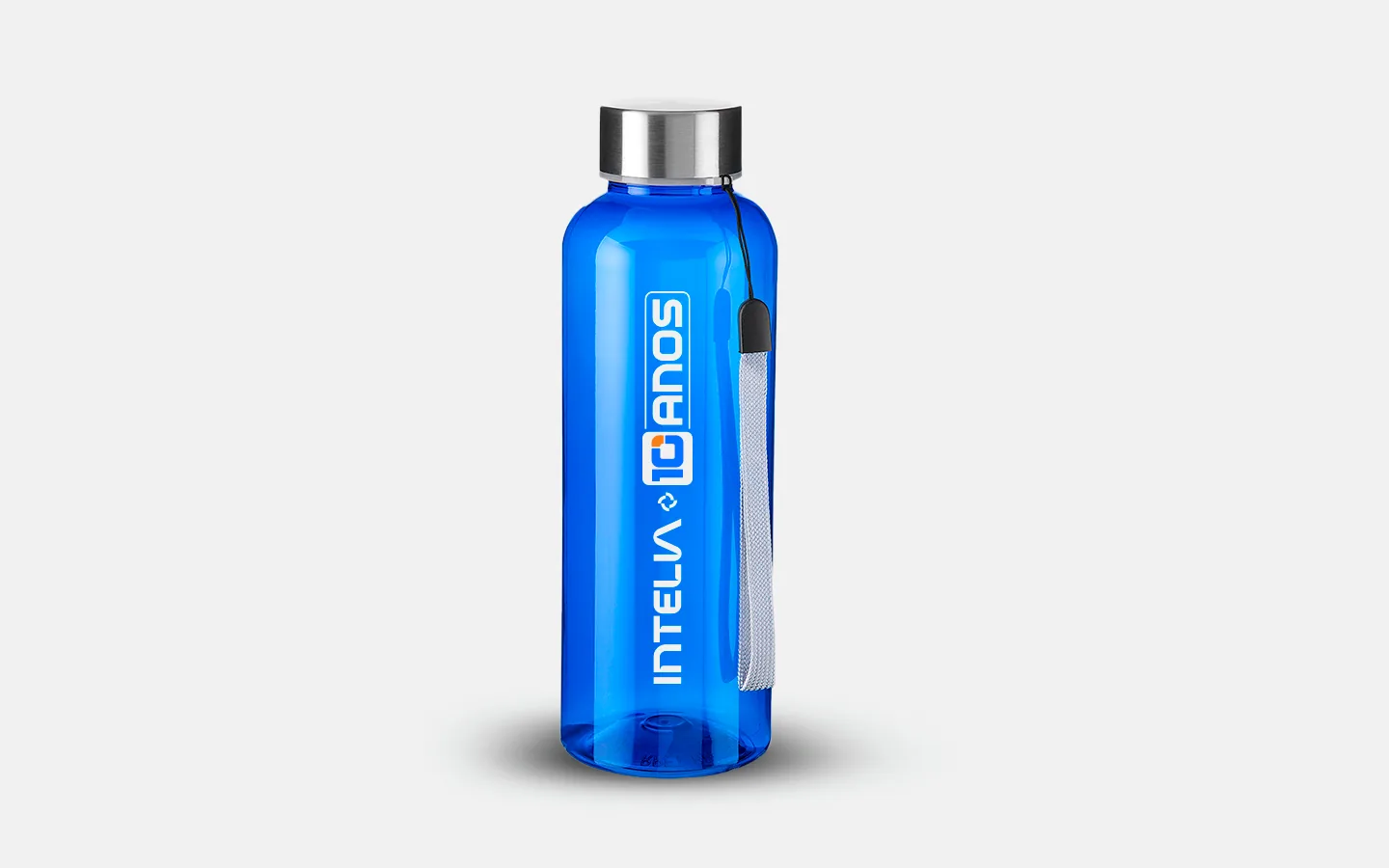
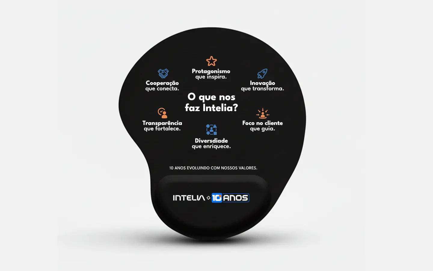
Three gifts close the circle: the ball, the bottle and the mousepad. The ball and the bottle carry the seal and nothing else.
The mousepad repeats the wheel: the question at the center and the six company values around it, cooperation, ownership, innovation, transparency, customer focus and diversity.
- Pieces
- 3 gifts
- Files
- vectors ready for production
10 years, 120 months, one turn.
- Client
- Intelia
- Project
- 10th anniversary visual identity
- Year
- 2025
- Deliverables
- logo in 8 versions, 6 profile icons, 4 carousels, 6 space mockups, 4 wallpapers, 2 e-mail headers, 6 LinkedIn covers, 3 gifts and the animated opening of 14 videos
Creative signatureMaycon & FelipeHarmony Studio
